
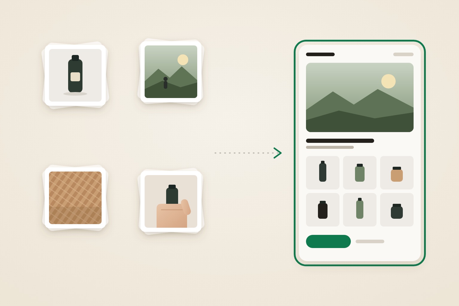
Most advice on how to design a Shopify store starts with picking a theme. That's step five, not step one. A theme is a set of layouts, and every theme demo looks good because its photography was chosen to fit it. Your store will use your photos. If they don't suit the layout, the result looks generic or dated, whichever theme you pay for.
This guide works the other way round. You start with what you have, choose a direction your store can actually support, and turn that direction into a handful of specific theme decisions.
Why your photos decide the design, not your theme
Shoppers look at images first. In Baymard Institute's usability testing, 56% of users' first action on a product page was to start exploring the product images (Baymard Institute). Homepages and collection pages are mostly image, too.
That makes your photo set the real limit on your design. A layout that opens on a full-width lifestyle image needs lifestyle images. A spare, minimal layout needs packshots that match each other exactly, because nothing else on screen distracts from a mismatched background. A dense catalog grid needs every product cropped the same way.
A theme can't fix any of this. It can only present what you give it. So the design decisions that matter most happen before you open the theme editor. The picture superiority effect explains why images carry so much weight: people remember pictures more readily than words.
How to design a Shopify store in six steps
- Audit your product photos. Sort them into piles and check how consistent they are.
- Check your catalog size and price position.
- Match your assets to a design style.
- Close the gap between the photos you have and the style you want.
- Turn the style into five theme decisions: type, color, buttons, image shape and density.
- Build it in a copy of your theme and test it on a phone.
Steps 1 to 3 need no design skills and no software beyond your Shopify admin.
Step 1: Audit your product photos
Open every image your store uses today, including homepage and collection banners. Don't judge them one at a time. Judge them as a set.
Sort them into four piles
- Packshots: the product alone on a plain background.
- Lifestyle: the product in use, with people, places or a styled setting.
- Detail: close-ups of texture, material, stitching, ingredients or finish.
- Scale: the product in a hand, on a body or next to a familiar object.
Most stores forget the scale pile. Baymard found that 42% of users try to judge a product's overall size from its images, yet 28% of the large retail sites it benchmarked had no image showing scale at all (Baymard Institute).
Check consistency before quantity
Put your packshots side by side and look for four kinds of mismatch.
- Shape. Shopify notes that your main product images display at the same size only if they share a consistent aspect ratio, and that square images of 2048 × 2048 px usually display best (Shopify Help Center).
- Background. White, off-white, grey and "whatever the table was" in one grid looks unfinished.
- Light. Warm and cool light side by side make one product line look like two brands.
- Resolution. An image that looks soft on a laptop will look worse as a full-width hero.
Give your photo set a profile
Most stores fit one of these seven profiles. Write yours down. It's the most useful input for the rest of the process.
| Profile | What your photos look like |
|---|---|
| A. Clean packshots | Consistent packshots, few or no lifestyle images |
| B. Packshots with personality | Consistent packshots of bold, illustrated or colorful packaging, plus in-hand shots |
| C. Lifestyle-rich | Many strong images of people, places or the product in use |
| D. Origin and process | Genuine photos of where or how the product is made |
| E. Styled still life | Art-directed scenes with props, in consistent light |
| F. Campaign and attitude | Campaign shoots, video and people, with a loud brand voice |
| G. Mixed and inconsistent | Different shapes, backgrounds and light from product to product |
Step 2: Check your catalog size and price position
Two more facts narrow the choice.
Catalog size. Count your active products. With fewer than about 20, you can give each product room and keep the design spacious. Dozens or hundreds need visible navigation, filters, a denser grid and a clear visual hierarchy, so shoppers know where to look first.
Price position. Decide what the design has to prove. A premium price needs calm, space, craft or origin. An everyday product that people reorder needs speed: clear navigation, obvious buttons and few distractions. A personality-led brand needs a design that amplifies what's already on the packaging.
Our guide to Shopify store examples grouped by design style shows these tests on real stores. Here you only need your answers.
Step 3: Match your assets to a design style
Now combine the three answers. The table uses the ten styles from our Shopify store examples guide, where each one is shown on live Shopify stores.
| If you have… | Styles your store can support now | Skip for now |
|---|---|---|
| A. Clean packshots, small catalog, premium price | Soft Minimal, Clinical Calm | Editorial Journal, Origin Story, Trail Natural |
| A. Clean packshots, large catalog | Pro Catalog | Editorial Journal, Warm Still Life |
| B. Packshots with personality | Retro Label, Color Pop | Editorial Journal, Origin Story |
| C. Lifestyle-rich, with a story to tell | Editorial Journal, or Trail Natural if the product is used outdoors | Pro Catalog, if you sell fewer than about 20 products |
| D. Origin and process | Origin Story | Color Pop, Pro Catalog |
| E. Styled still life | Warm Still Life | Pro Catalog, Color Pop |
| F. Campaign and attitude | Loud & Irreverent | Clinical Calm, Soft Minimal |
| G. Mixed and inconsistent | None yet. Fix the photo set first (Step 4) | Soft Minimal, which exposes every mismatch |
Before you commit, run two more checks.
- Test against your weakest page, not your best image. Pick the bestseller with the worst photos and picture it in the new style. If it looks out of place, the style will fail where it matters most.
- Check you can keep it up. Editorial Journal needs new stories and photos regularly. Origin Story needs photos that are genuinely yours. A style you can't maintain looks abandoned within months.
If you'd rather see a direction on your own store than imagine it, this is where Prettifai fits: you choose a direction, and it builds that direction as a private draft theme from your existing products and photos.
Step 4: Close the gap between your photos and the style you want
The style you want and the style your photos support are often different. You have three honest options.
Reshoot a minimum set. You don't need a new shoot for the whole catalog. Start with what shoppers see first: the homepage hero, your top five to ten products and one banner per collection. A lifestyle-led style such as Editorial Journal needs roughly six to ten strong horizontal images that hold up at full width. Add one scale shot to every bestseller.
Standardize what you have. Many photo problems are really consistency problems. Re-crop every main image to one aspect ratio, put packshots on the same background, and match exposure and white balance. That's often enough to make a mixed set (profile G) work in a structured style like Pro Catalog or Clinical Calm. If images still crop badly in some sections, the cause is usually the theme's image container rather than your file. Our guide to why Shopify image cropping ignores your image size explains what's happening.
Choose the neighboring style. If you want Editorial Journal but only have packshots, start with Soft Minimal and add one editorial section once you have the images. If you want Origin Story but have no origin photos, don't substitute stock landscapes. Shoppers spot them, and they undercut the very claim the style makes.
Whatever you choose, don't fill the gap with images that misrepresent the product, such as stock scenes showing someone else's goods or AI-edited shots that change its color or texture. Every gap between the photo and the parcel adds doubt, and product-page doubt kills purchase intent.
Step 5: Turn the style into five theme decisions
A style only helps once it becomes specific settings. In the Shopify theme editor, typography and colors live under Theme settings, and changes there apply to your entire store (Shopify Help Center). Make these five decisions there once, instead of section by section.
- Type. Use one typeface, or two at most: one for headings, one for body text and buttons. Take the typeface from the style, not from what's popular. A serif headline suits the warmth of Warm Still Life. A plain, sturdy sans-serif suits Pro Catalog. Heavy condensed capitals belong to Color Pop and Loud & Irreverent, and only when the brand really is that loud. Shopify also suggests considering system fonts, since they're already installed on shoppers' devices and don't slow the page with a font download (Shopify Help Center).
- Color. Choose a background, a text color and one accent for buttons and links. Most Shopify themes group colors into color schemes that you apply to sections, and Horizon 4.0.0 and newer use a named color palette instead (Shopify Help Center). Either way, keep the set small and check contrast. WCAG asks for a contrast ratio of at least 4.5:1 for normal text and 3:1 for large text (W3C). Color Pop and Retro Label need this check most, because their text often sits on saturated color.
- Buttons. Use one primary button style everywhere: the same shape, color and label style. Rounded pills feel softer and suit Soft Minimal, Clinical Calm and Warm Still Life. Square corners feel sturdier and suit Trail Natural and Pro Catalog.
- Image shape. Pick one aspect ratio for product cards, square or portrait, and one for banners. Crop every image to them. This is what makes a grid look deliberate, and it's the law of similarity at work: things that look alike read as a set.
- Density. Decide how much room each product gets. Small catalogs and premium prices can use large images, fewer products per row and generous spacing. Large catalogs need more products per row, filters and a visible search bar.
Write the five decisions down as a one-page style sheet, and use it for every future banner, product page and campaign. That's how a store avoids the slow drift described in why website design gets worse over time.
Here's what two style sheets can look like.
| Decision | Soft MinimalSkincare brand, consistent packshots, small catalog | Pro CatalogKitchenware brand, 200 products |
|---|---|---|
| Type | One sans-serif for everything, with large sentence-case headlines | One sturdy sans-serif, with clear size steps between headings and body text |
| Color | Off-white background, near-black text, one accent taken from the packaging | White background, dark text, one strong button color |
| Buttons | Rounded pill, dark fill | Solid fill, square corners, the same color on every page |
| Image shape | Square packshots on one background, plus one texture close-up per product | Square packshots with the same angle and crop across the range |
| Density | Three products per row on desktop, generous spacing | Four products per row, with filters and search visible on collection pages |
Step 6: Build it in a copy of your theme and test it on a phone
Don't design on your live theme. Shopify recommends making a backup copy before you customize a theme, so you can discard your changes and start again (Shopify Help Center). You can also share a preview link of any unpublished theme to get feedback before you publish (Shopify Help Center). Our guide to redesigning a Shopify store without touching the live theme covers the full workflow.
Then open the preview on your phone, not only on your laptop, and run five checks.
- The five-second test. Show the homepage to someone who doesn't know your brand for five seconds. Can they say what you sell and whether it's premium or everyday?
- The weakest-product test. Open the bestseller with the worst photos. Does it still look like it belongs?
- The crop test. Scroll every collection. Is anything cut off at a head, a label or an edge?
- The button test. Is add-to-cart the most visible element on the product page, with readable contrast?
- The consistency test. Do the homepage, a collection page and a product page look like the same store?
When a check fails, go back to Step 4 or Step 5. Don't switch themes.
Use other stores for ideas, not templates
Looking at other stores helps, as long as you look at the right ones. Compare your store with stores that share your photo profile, catalog size and price, not only your category. That's why our Shopify store examples are grouped by style rather than by product.
Take principles: how much space each product gets, how few typefaces a store uses, how its color repeats. Leave logos, layouts, photography and copy. A store that looks like a copy of a famous brand can feel as untrustworthy as a generic one, as we explain in why a generic store makes good products feel risky.
FAQ
What are the key steps to designing a Shopify store?
Audit your product photos, check your catalog size and price position, and match those assets to one design style. Close any gap by reshooting or standardizing images. Then turn the style into settings for type, color, buttons, image shape and density, build it in an unpublished copy of your theme, and test it on a phone before you publish.
How can I design my Shopify store effectively?
Make fewer design decisions and apply them everywhere. One or two typefaces, a small color set, one button style and one image shape, set once in your theme settings, do more for a store than new sections or apps. Choose them to suit the photos you already have, so the design never needs images you can't supply.
How do I make my Shopify store look professional?
Consistency does most of the work. Crop every product image to the same aspect ratio, shoot packshots on one background in the same light, limit your fonts and colors, and use one button style across the store. Then check text contrast and test every page type on a phone.
Do I need a designer to design my Shopify store?
Not always. If your photos are consistent and your theme settings can produce the style you chose, the steps above are enough to do it yourself. Outside help is worth it when your photos need a reshoot, your theme can't produce the look you need, or you don't have time to apply the design consistently across every page.
Can I design a Shopify store with AI?
Yes, but judge the result the way you'd judge a designer's work. Does it use your real products and photos? Does it hold together on a phone? Can you still edit it in Shopify's theme editor? Prettifai works this way: you choose a direction, and it builds the redesign in a private draft theme from your existing store, so your live store keeps selling while you review it.
Sources
- Baymard Institute: Ensure Sufficient Image Resolution and Zoom (2020; 56% of users explored images first; accessed September 22, 2026)
- Baymard Institute: Provide at Least One "In Scale" Image (2017; 42% and 28% figures; accessed September 22, 2026)
- Shopify Help Center: Product media types (aspect ratio and image size guidance, accessed September 22, 2026)
- Shopify Help Center: Customizing theme settings (store-wide typography and colors, system fonts, accessed September 22, 2026)
- Shopify Help Center: Color customizations settings (color schemes and color palettes, accessed September 22, 2026)
- Shopify Help Center: Duplicating themes (backup copy before customizing, accessed September 22, 2026)
- Shopify Help Center: Adding, previewing, and buying themes (sharing a preview of an unpublished theme, accessed September 22, 2026)
- W3C: Understanding Success Criterion 1.4.3, Contrast (Minimum) (WCAG 2.2, accessed September 22, 2026)