
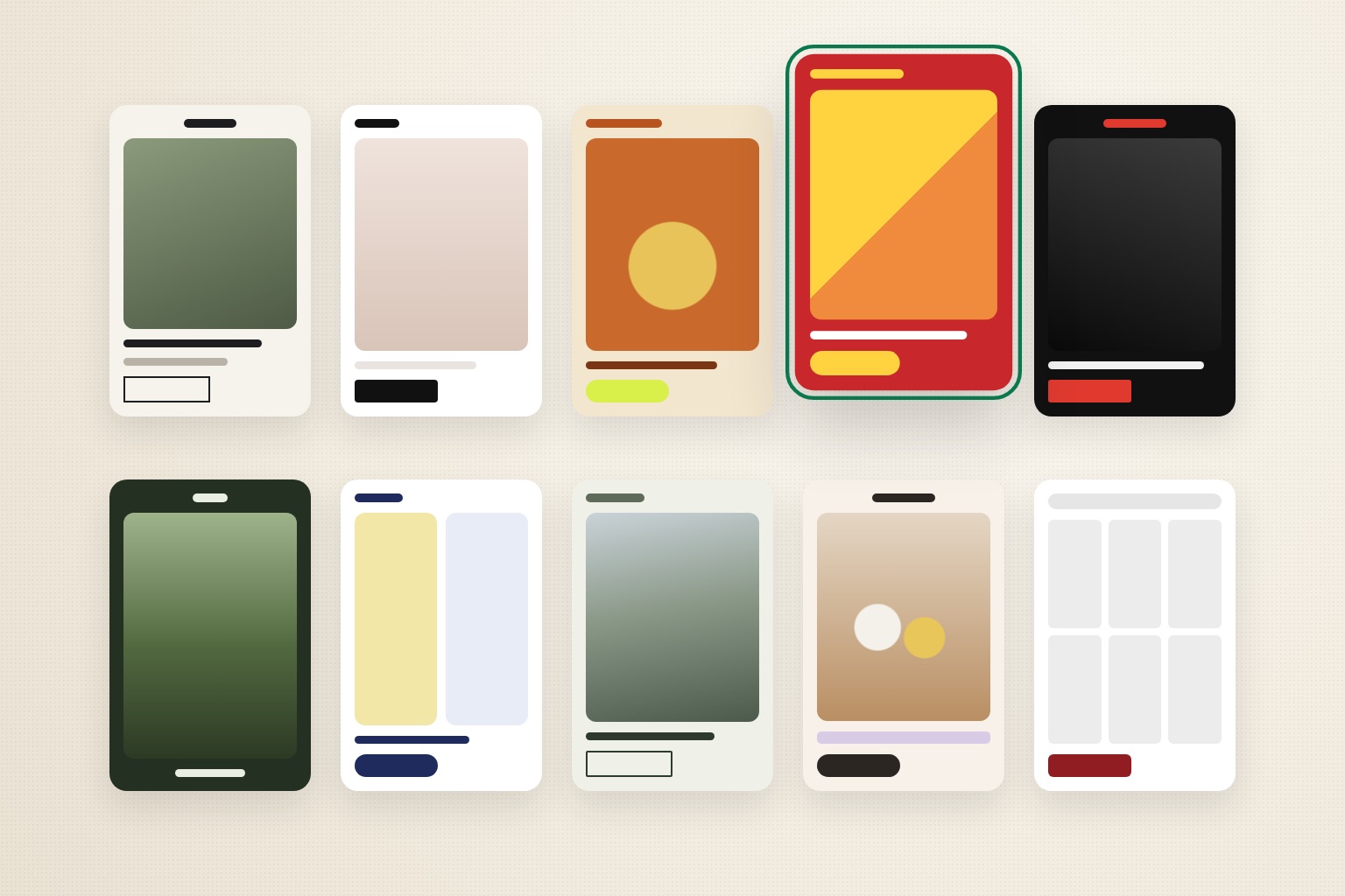
The most useful Shopify store examples are the ones that look the way your store could look. This guide sorts real Shopify stores by design style instead of by what they sell. Each style lists the visual traits that define it, the kind of brand it suits, who should avoid it, and the photos it needs to work.
If your store looks generic or dated, the fix is rarely a new product category page or another app. Usually the store has no clear visual direction. A 50-store gallery won't give you one. You need to know which direction fits your products, your prices and the photos you already have.
Why most Shopify store examples don't help you choose
Most "best Shopify stores" lists sort brands by what they sell: fashion, beauty, food, home. That tells you what other stores in your category exist. It doesn't tell you what your store should look like. Two skincare brands can look nothing alike, and a coffee roaster can share more visual DNA with an outdoor brand than with another roaster.
Those lists also rarely mention the thing that decides whether a look will work for you: your photography. A store built around full-bleed lifestyle images falls apart when all you have are white-background packshots. A dense catalog layout looks empty with eight products.
So each style below comes with three filters: who it's for, who should avoid it, and the photos it needs. Read the examples for their principles, not for layouts to copy. The aesthetic-usability effect explains why getting this right matters. Shoppers judge how easy and trustworthy a store is by how it looks.
Shopify store examples, grouped by design style
Every store below was checked on September 18, 2026: it loaded, and its storefront runs on Shopify. Homepages change often, so the descriptions cover each site's overall direction, not a specific campaign banner. The brands are here as inspiration only. Don't copy their logos, layouts, photography or copy.
1. Editorial Journal
Examples: Hiut Denim Co. (UK), Kotn
What it looks like: The homepage reads like a magazine cover. Hiut gives "Story" and "Guides" the same top-level billing as "Shop" and opens with features about people rather than products. Headlines are short and confident. Navigation labels are small, widely letter-spaced capitals. The background is off-white rather than pure white. Kotn does a lighter version: one large lifestyle photograph with a clean sans-serif headline over it and very little else.
Best for: founder-led brands with a real origin or making story, such as apparel, denim, homeware, craft goods and small-batch makers.
Avoid if: you can't produce new stories, photos or features regularly. An editorial homepage with one stale story looks abandoned faster than any other style.
Photos it needs: horizontal lifestyle shots with people and places, not just product. Aim for at least 6–10 strong images that hold up full-width.
2. Soft Minimal
Examples: Glossier, Summer Fridays
What it looks like: Big photography, a small amount of type, and a narrow color range. Glossier pairs large lowercase sans-serif headlines with a small white text box and a single button, keeping the interface chrome black and white. Summer Fridays centers a wide-tracked wordmark and builds its palette from the soft blues of its packaging. The hero splits product on one side and a face on the other.
Best for: beauty, skincare, fragrance and premium basics. It suits brands whose packaging is already distinctive, because the packaging supplies the color.
Avoid if: your product photos are inconsistent (mixed backgrounds, lighting or angles). Minimal layouts leave nowhere to hide, so every inconsistency shows. Also avoid it with a large catalog and no clear hero products.
Photos it needs: a consistent packshot set on matching backgrounds, plus a few tight close-ups of texture or skin. Consistency matters more than quantity.
3. Retro Label
What it looks like: The packaging design carries the whole site. Olipop uses rounded, retro-style display type, a warm burnt-orange and cream palette, and hand-drawn illustration around the cans. Graza pairs a bold, condensed wordmark with a large serif headline and a bright chartreuse pill button that matches its bottle label.
Best for: food, drink and consumer goods whose packaging already has an illustrated or vintage personality.
Avoid if: your packaging is plain or generic. The site can't borrow a personality your product doesn't have, and the result reads as costume. Also avoid it if you sell premium or clinical products where "fun" undercuts the price.
Photos it needs: clean, well-lit packshots where the label is readable, plus in-hand or in-use shots. You'll also need illustration or graphic assets in the packaging's style.
4. Color Pop
Example: Fly By Jing
What it looks like: Large areas of flat, saturated color. Fly By Jing sets a deep red background against yellow pill buttons, uses heavy condensed uppercase headlines, and gives each product category (sauces, noodles, gift sets) its own colored tile.
Best for: snack, condiment, beverage and other food brands with a small number of bold product lines, especially brands that sell through bundles and gift sets.
Avoid if: you have more than a few dozen products, or products that need calm to feel premium. Saturated color everywhere tires the eye across a big catalog. It also needs careful contrast checks so text stays readable on colored backgrounds.
Photos it needs: cut-out or plain-background product images that sit cleanly on colored blocks, plus a few high-energy food or serving shots.
5. Loud & Irreverent
Examples: Liquid Death, Death Wish Coffee
What it looks like: The brand's voice is the design. Liquid Death uses heavy, condensed, italic capitals and a humor-first video hero. Death Wish Coffee runs on a black background with red buttons, a skull crest centered in the header, and bold uppercase headlines.
Best for: brands with a strong, established attitude, usually beverage, coffee and lifestyle products aimed at buyers who like the joke.
Avoid if: the attitude isn't already in your product, packaging and social channels. On a store with a quiet brand, this style reads as borrowed. It also narrows your audience on purpose, so make sure that's the plan.
Photos it needs: content with personality, such as campaign shots, video and people. Plain packshots alone won't carry it.
6. Origin Story
Example: Onyx Coffee Lab
What it looks like: The first screen is almost entirely photography of where the product comes from. Onyx opens on a full-bleed image of a coffee farm, with a single white brand mark in the center and very little interface.
Best for: coffee, tea, chocolate, wine and other products where origin, farm or process is the reason to pay more.
Avoid if: you don't have genuine origin photography. Stock landscapes are easy to spot and undercut the whole point. Also avoid it if your buyers mainly reorder the same thing, since a big atmospheric hero slows down a quick repurchase.
Photos it needs: high-resolution, wide landscape and process images, several of them, and all genuinely yours.
7. Clinical Calm
Example: Ritual
What it looks like: Restrained and orderly. Ritual works in navy, white and a soft yellow. Its hero splits a photograph on one side from a short headline on the other, with a single italic serif word as the only decorative touch. Rounded navy pill buttons carry the calls to action.
Best for: supplements, wellness, personal care and skincare brands that want to feel careful and transparent rather than playful.
Avoid if: you'd be tempted to fill the calm layout with claims. This style signals trust, and that raises the stakes on what the words say. Keep product copy factual and within what you're allowed to say. Also avoid it for gift-led or impulse products, where it can feel cold.
Photos it needs: clean product shots, a few calm lifestyle images, and clear, well-lit shots of labels and ingredients panels.
8. Trail Natural
What it looks like: Landscape photography with real people in it, framed by a muted palette. Tentree sets a serif headline over a mountain scene, with a sage-and-cream interface and outlined, square-cornered buttons. Cotopaxi uses a heavy sans-serif headline over forest-trail photography, and "Packs + Gear" sits in the main navigation.
Best for: outdoor apparel and gear, sustainable basics, and travel products.
Avoid if: your product is never used outdoors. Mountains behind a desk accessory make no sense. Also avoid it if all your images are studio shots.
Photos it needs: in-the-field lifestyle images of the product in use, plus consistent studio shots for collection grids. Technical products also need detail shots of fabrics, zips and features.
9. Warm Still Life
Example: Brightland
What it looks like: The product is shown in a styled scene rather than on a blank background. Brightland photographs its bottles on a kitchen counter surrounded by ingredients, cloth and wooden tools. A wide-letterspaced wordmark sits centered, the headline is serif, the buttons are dark rounded pills, and soft pastel bands separate sections.
Best for: pantry, kitchen, home fragrance, ceramics and gifting brands with a premium but approachable price.
Avoid if: you can't commission styled photography. This style depends almost entirely on the quality of its still-life shots. It also struggles with very large catalogs.
Photos it needs: art-directed still-life images in a consistent setting and light, plus plain packshots for product grids.
10. Pro Catalog
Example: Made In
What it looks like: Built for shopping a big range. Made In gives search a prominent place in the header, lays out a long category menu (cookware, knives, tabletop, bakeware and more), uses a deep red for buttons, and pairs it with a photo of a chef at work. The type is a plain, sturdy sans-serif.
Best for: brands with large or technical catalogs such as kitchenware, tools, parts, pet supplies and multi-category stores, where shoppers arrive knowing what they want.
Avoid if: you sell a handful of products. Heavy navigation and search make a small store look empty.
Photos it needs: consistent packshots across the whole range (same angle, background and crop), so grids look orderly. A few in-use images add authority.
| Style | Best for | Photos it needs most | Catalog size |
|---|---|---|---|
| Editorial Journal | Founder-led apparel, home, craft | Lifestyle with people and places | Small to medium |
| Soft Minimal | Beauty, skincare, premium basics | Consistent packshots, texture close-ups | Small, clear heroes |
| Retro Label | Food and drink with illustrated packs | Readable packshots, in-hand shots | Small |
| Color Pop | Snacks, sauces, gift bundles | Cut-outs, high-energy food shots | Small |
| Loud & Irreverent | Brands with an established attitude | Campaign images and video | Small to medium |
| Origin Story | Coffee, tea, chocolate, wine | Genuine origin and process images | Small to medium |
| Clinical Calm | Wellness, personal care, skincare | Clean packshots, label close-ups | Medium |
| Trail Natural | Outdoor apparel and gear | In-the-field lifestyle, detail shots | Medium to large |
| Warm Still Life | Pantry, kitchen, home, gifting | Art-directed still life | Small to medium |
| Pro Catalog | Large or technical ranges | Consistent packshots across the range | Large |
How to tell if a style will work for your store
Picking a style you like is easy. Picking one your store can support takes three quick tests. Do them before you commit to any direction, whether you use a theme, a designer or an automated redesign.
The photo test
Open your product images and sort them into three piles:
- Packshots: product on a plain background.
- Lifestyle: product in use, with people or places.
- Detail: textures, materials, close-ups.
Then compare the piles with what each style needs. If most of your images are packshots, lean toward Soft Minimal, Color Pop, Clinical Calm or Pro Catalog. If you have lots of strong lifestyle images, Editorial Journal, Trail Natural or Origin Story become realistic. If you have almost no lifestyle images, don't choose a style that opens on a full-width lifestyle hero.
Check consistency too. Shopify advises using one aspect ratio across product images so they display at the same size, and says square images of about 2048 × 2048 px usually look best (Shopify Help Center). Mixed shapes and sizes break minimal and catalog layouts first. If your images crop badly in some sections, our guide to why Shopify image cropping ignores your image size explains what's happening.
The catalog test
Count your active products and collections.
- Under about 20 products: styles that give each product space work best: Soft Minimal, Retro Label, Color Pop, Warm Still Life, Origin Story.
- Dozens to hundreds: you need strong navigation and filtering. Pro Catalog, Trail Natural or Clinical Calm hold up better.
A strong visual hierarchy matters more as the catalog grows. The shopper has to know where to look first.
The price and promise test
Ask what the design has to prove.
- Premium price: the design must justify it with calm, space, craft or origin. Soft Minimal, Editorial Journal, Warm Still Life and Origin Story do that.
- Everyday price, repeat purchase: the design must make reordering fast. Pro Catalog and Clinical Calm do that.
- Personality-led brand: the design must amplify something that's already there. Retro Label, Color Pop and Loud & Irreverent do that, but only if the product and packaging carry the same personality.
If a style passes all three tests, it's a real candidate. If it only passes "I like how it looks", it's a mood board. This is where Prettifai helps. Instead of guessing from someone else's store, you can pick a direction and see it built as a private draft theme from your own products and photos.
What to take from examples, and what to leave
Good examples teach principles you can reuse:
- Take: how much space the store gives each product, how many typefaces it uses (often just one or two), how color is limited and repeated, where the main button sits, and how photography is cropped consistently.
- Leave: logos, brand names, exact layouts, photography, illustrations, copy and anything that makes a shopper think your store is theirs. Copying distinctive trade dress is a legal risk and a brand risk, and it rarely fits your products anyway.
The goal is a store that looks deliberate, not one that looks like a famous brand. A store that looks generic makes good products feel risky, as we cover in why a generic store makes good products feel risky, and an imitation can feel risky in the same way. For the trends shaping these styles this year, see ecommerce design trends 2027. For why texture and imagery affect how products feel, see sensory appeal. And for the reasoning behind every choice above, browse our library of ecommerce design principles, each with real store examples.
FAQ
What are some good Shopify store examples?
Good examples depend on the style you're aiming for. Hiut Denim for Editorial Journal, Glossier for Soft Minimal, Olipop for Retro Label, Fly By Jing for Color Pop, Onyx Coffee Lab for Origin Story, Tentree for Trail Natural and Made In for Pro Catalog are all Shopify stores with a clear, consistent direction. Pick examples that share your photo situation and catalog size, not just your product category.
How do I design my Shopify store?
Start from what you have, not from a theme. Sort your product photos into packshots, lifestyle and detail images, count your products, and decide whether your design needs to justify a premium price or speed up repeat orders. Then choose the style those assets support, and apply it consistently across typography, color, buttons and image crops. Our step-by-step guide to how to design a Shopify store around the photos you already have walks through each stage.
Can I copy a Shopify store design I like?
Use other stores for principles, not copies. You can learn from how a store uses space, type and color. Don't reproduce its logo, layout, photography, illustrations or copy. Distinctive trade dress can be legally protected, and a copied look rarely fits your own products and photos.
How do I find design ideas for my Shopify store?
Look at stores that share your constraints (a similar number of products, similar photography, a similar price point) rather than only stores in your category. Grouping examples by style, as this guide does, makes it easier to see which direction your store could realistically take.
When should I hire a designer for my Shopify store?
Consider outside help when your store has no clear visual direction, when your theme settings can't get you the look you need, or when you don't have time to maintain consistency across every page. Whichever route you take, make sure the work happens in an unpublished draft theme so your live store keeps selling while you review it. Here's how to redesign a Shopify store without touching the live theme.
Sources and examples
- Shopify Help Center: Product media types (image size and aspect ratio guidance, accessed September 18, 2026)
- Store examples: each storefront was opened on September 18, 2026 and confirmed to load and serve Shopify storefront assets. Descriptions reflect the homepages on that date.