
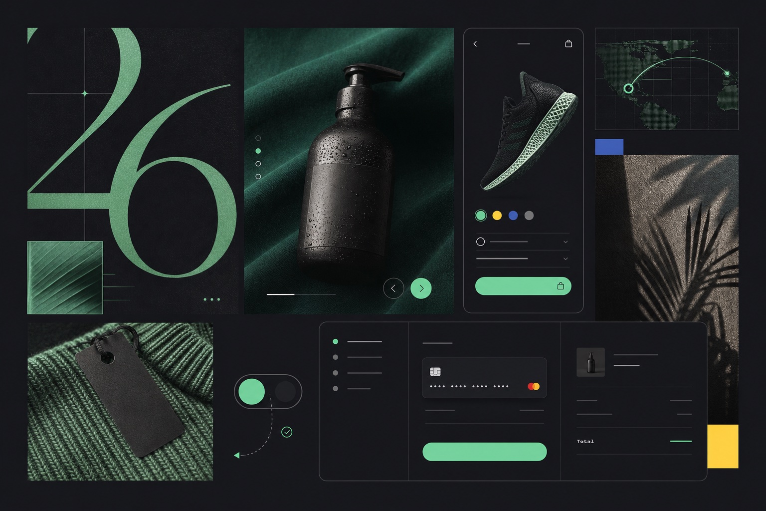
Dribbble can show where visual language is moving faster than almost any commerce platform. It can also seduce a team into building a homepage that works beautifully as a 1600-pixel image and terribly as a store.
The examples below are real Dribbble projects linked for visual reference. They are not proof of conversion performance. To decide whether a pattern belongs in a real store, we pair creative inspiration with Baymard’s large-scale ecommerce usability research, Shopify’s 2026 UX reporting, and W3C accessibility guidance.
1. Editorial commerce makes the product feel culturally important
Traditional ecommerce grids treat products as database rows. Editorial commerce treats them like a story: dramatic scale, art-directed cropping, fashion typography, asymmetry, and deliberate pacing. It can move a brand out of commodity comparison and into a world the customer wants to enter.
Zonda Studio’s Womenswear Ecommerce Website Design combines oversized typography, butter yellow, cobalt, and magazine-like composition. Mike Taylor’s fashion-store concept uses a quieter split layout and refined whitespace.
The conversion guardrail: editorial framing must not delay product understanding. Above the fold, shoppers still need to know what is sold, why it is different, and how to browse. On product pages, beauty must coexist with price, variants, shipping, returns, imagery, and a clear purchase action.
2. Oversized typography is replacing decoration with a point of view
Large type can create personality without adding image weight or another JavaScript dependency. It makes a strong message unavoidable and gives a small brand scale. Variable fonts and fluid type let the same system adapt across viewports more gracefully than fixed display treatments.
Sifat Hasan’s Fashion Ecommerce Website uses dark editorial framing and assertive type, while this bold minimal fashion UI shows how type can carry much of the visual identity.
The conversion guardrail: a 140-pixel headline is not automatically readable. Test line breaks with real copy, localization, browser zoom, and mobile widths. Keep the semantic heading structure intact. Ensure display faces remain legible and do not push the next useful action below several screens.
3. Tactile texture and analog imperfection are an answer to synthetic sameness
As AI makes clean gradients and polished layouts effortless, texture becomes evidence of taste. Grain, paper, scanned marks, imperfect lines, flash photography, food imagery, and analog references can make a digital storefront feel physical and specific.
Shopify’s 2026 trend reporting highlights textured interfaces and analog-inspired design. Its broader design roundup points to nostalgia, nature, culinary imagery in unexpected categories, and immersive full-screen visuals. The common thread is sensory memory.
The conversion guardrail: texture should support art direction, not reduce contrast or clarity. Use compressed overlays sparingly. Never bake essential text into an image. Keep controls visually distinct, and test that grain does not make smaller type or disabled states ambiguous.
4. Bento grids make many ideas feel like one system
Bento compositions organize unequal cards into a modular field. They are useful for stores that need to communicate product, proof, category, editorial content, video, and benefit without stacking six identical full-width sections.
Harpreet Singh’s ecommerce bento-grid exploration shows the pattern as a compact visual system rather than a generic feature dashboard.
The conversion guardrail: modular does not mean equal. One card must lead. Reading order must remain sensible when the grid collapses on mobile. Avoid putting essential calls to action in visually minor tiles or creating a desktop mosaic that becomes twelve unrelated rectangles on a phone.
5. Surreal product worlds create dopamine, but reality must return before checkout
Unexpected scale, layered frames, warped surfaces, collage, 3D spaces, and imaginative transitions make a brand memorable. They are particularly effective for fashion, beauty, music, sports, youth culture, and limited drops where identity matters as much as utility.
Wonklab’s ecommerce concept by Sifat Hasan combines oversized typography, surreal visuals, layered frames, and a Gen-Z editorial energy.
The conversion guardrail: a shopper still needs honest product evidence. Baymard’s product-page research found 52% of desktop, 62% of mobile, and 64% of app implementations were “mediocre or worse.” Give users high-resolution images, multiple angles, contextual scale, relevant details, and clear variation selection. A fantasy homepage cannot compensate for an uncertain product page.
6. Slow browsing is the most counterintuitive response to the dopamine web
Shopify’s 2026 UX report describes “slow browsing” as a quieter reaction to constant stimulation, infinite scroll, and feature accumulation. It means fewer competing messages, more breathing room, and an experience that invites attention instead of attacking it.
This does not mean slow loading. It means calm pacing: one strong product story, deliberate progression, fewer carousels, and less simultaneous motion. The site feels confident enough not to shout every offer at once.
The conversion guardrail: quiet design cannot hide navigation or create mystery around basic commerce. Let people browse slowly because content is good, not because controls are invisible or animations prevent them from moving faster.
7. Mobile product pages are becoming the real brand experience
Mobile is no longer the compressed version of the desktop concept. For many stores it is the dominant storefront. Baymard says mobile produces roughly three quarters of retail site visits, yet its 2026 benchmark rated 75% of mobile ecommerce sites “mediocre” overall and only one of 150+ sites “good.”
Fahad Ibn Sayeed’s Luxury Fashion Mobile Ecommerce UI is a useful reference for carrying editorial art direction into a narrow interface rather than treating mobile as an afterthought.
The conversion guardrail: test the unglamorous states. Can shoppers see gallery position, access all images, understand variants, find shipping and returns, distinguish the sticky purchase control, recover from validation errors, and use the back button as expected? A mobile shot is not mobile UX until the whole path works.
8. Purposeful motion explains change; decorative motion taxes attention
Micro-interactions can make a store feel finished: a variant image crossfades, a cart confirms an addition, a filter indicates that results changed, or a navigation transition preserves spatial context. Motion is most valuable when it answers “what just happened?”
The conversion guardrail: remove choreography that delays interaction, hijacks scrolling, shifts controls, or makes the shopper wait for a reveal. The W3C recommends respecting the operating system’s prefers-reduced-motion setting because interaction-triggered animation can distract users or trigger vestibular symptoms.
9. Performance has become a luxury signal customers can feel
Shopify’s 2026 UX report calls performance a luxury signal: fewer features, integrated with more care. This matters because every trend can be implemented badly. Full-screen imagery can become a multi-megabyte hero. Texture can add layers. Variable fonts can multiply files. Motion can monopolize the main thread. Personalization can create a stack of third parties.
A premium store responds immediately. Images arrive at the right dimensions. Menu and cart actions feel solid. Layout does not jump. The page does not wait for five marketing scripts before becoming useful.
The conversion guardrail: set a performance budget before art direction becomes code. Use responsive images, modern formats, font subsetting, lazy loading below the fold, restrained dependencies, and real-device checks. Remove an effect when its cost exceeds the customer value it creates.
10. The most important trend is continuous design, not a 2026 visual costume
A trend list becomes dangerous when it encourages a complete visual reset. The store launches with current references, then products, campaigns, apps, and new trends create another layer. Two years later the original system is fragmented and the team believes another rebuild is required.
Instead, adopt patterns as hypotheses. Apply one to a suitable page in a safe draft. Check mobile, accessibility, speed, and native editability. Measure whether customers browse, understand, and buy more successfully. Promote winners into the design system and remove the components they replace.
The goal is not to look like 2026. It is to remain unmistakably your brand while the website keeps learning.
Research and examples
- Shopify: Six ecommerce UX design trends for 2026
- Shopify: Website design examples and trends for 2026
- Baymard: Mobile UX trends 2026
- Baymard: Product Page UX 2026
- Baymard: Ecommerce UX examples
- W3C: Using prefers-reduced-motion
- Dribbble: Womenswear Ecommerce Website Design, Bento Grid Exploration, Ecommerce Website Design, and Luxury Fashion Mobile Ecommerce UI