
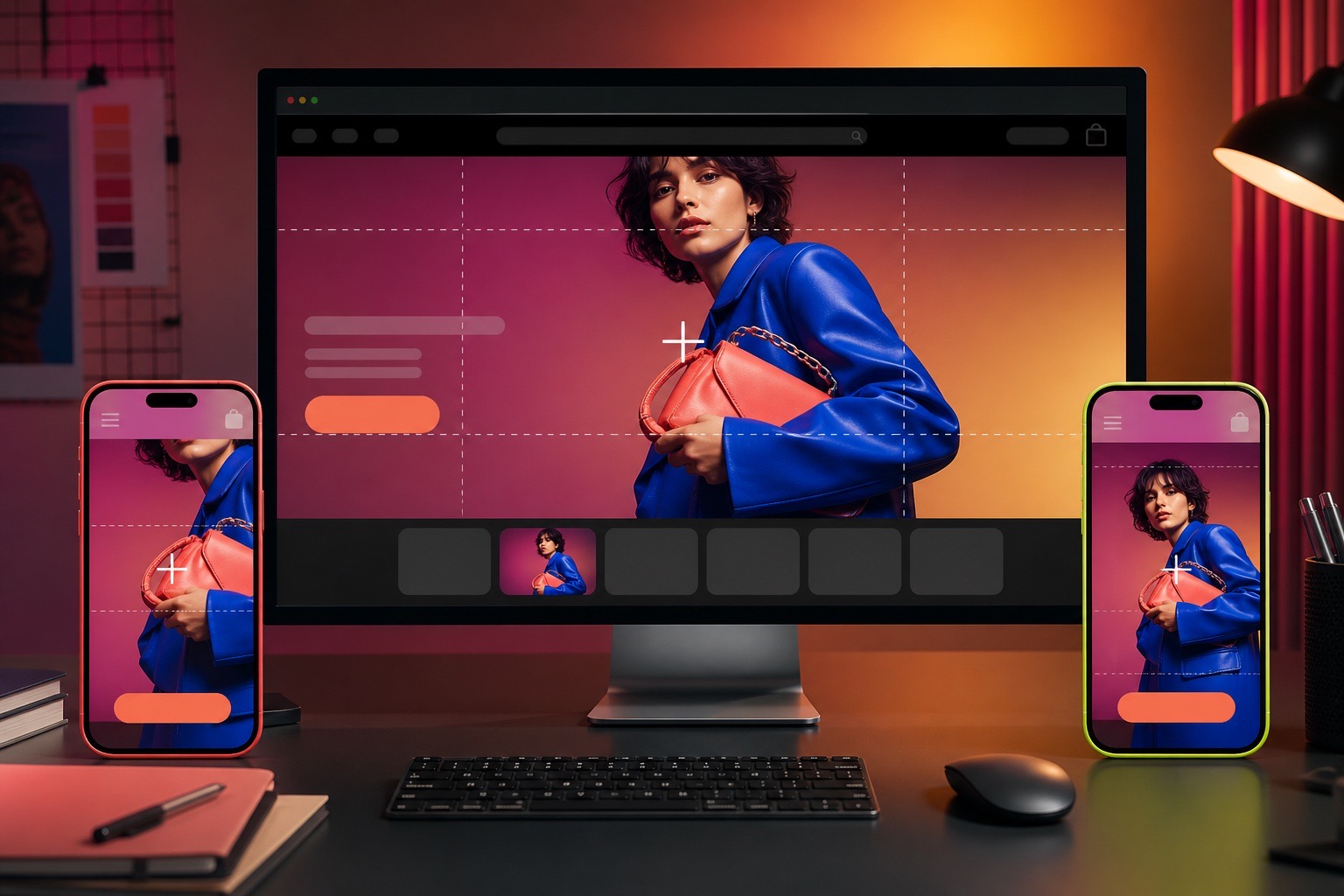
If you have resized the same banner five times and Shopify still cuts off the product, you are not missing an obvious button. Image behavior is split across the source file, the section settings, the theme's code, and the width of the preview. Those controls often use labels such as small, large, adapt to image, or image height without showing the actual shape they will create.
That is why a beginner can do everything that sounds reasonable, including uploading more pixels, trying another file format, choosing a different height, and checking the mobile icon, yet still get a crop that feels unpredictable.
Shopify merchants describe the same frustrating loop
This is not a theoretical CSS problem. Shopify Community posts show merchants repeatedly hitting the same three failures.
“No matter how I resize the photo it doesn’t work.”
Shopify Community merchant troubleshooting a Trade theme banner
“Looks perfect in the editor. But the actual site, the image gets zoomed in and cropped.”
Shopify Community merchant comparing the editor with a live Origin theme
“If I set the image banner to large then it is cropping in mobile device.”
Shopify Community merchant testing banner-height settings
These merchants tried different sizes, shapes, formats, height presets, and code. One setting improved desktop but damaged mobile. Another preserved the image but left empty space. In one case, the editor preview did not match the saved storefront. The interface made several different problems look like one image-size problem.
Image size can mean three different things
Before changing another file, separate these three ideas:
- Resolution is the number of pixels in the source file, such as 2400 × 1600. More pixels can improve sharpness. They do not decide the banner's on-page shape.
- Aspect ratio is the shape of the image or container, such as 3:2, 16:9, or 1:1. Two files can have different resolutions and the same aspect ratio.
- Rendered size is the width and height of the box on the actual storefront. The theme controls this box, and it can change between desktop and mobile.
Suppose you replace a 1200 × 800 image with a 2400 × 1600 image. Both are 3:2. If the theme displays them inside a wide 16:9 banner, both can lose the same top and bottom area. The second file is sharper, but its composition is unchanged.
The theme chooses between cropping and empty space
Most edge-to-edge banners use the CSS behavior known as object-fit: cover. It enlarges the image until the entire section is filled. When the image and section have different shapes, the extra area falls outside the frame and disappears.
The alternative, contain, keeps the complete image visible. It can also create blank bars when the shapes do not match. That tradeoff explains why advice to switch from cover to contain can solve the crop and immediately create a new complaint about gaps.
Neither behavior is wrong. Choice depends on the job:
- Use a full-image treatment when every edge or product detail must remain visible.
- Use an edge-to-edge crop when filling the section matters more than preserving every edge.
- Use separate desktop and mobile compositions when one crop cannot communicate the same idea in both shapes.
Why desktop and mobile disagree
A desktop hero is usually wide and shallow. A mobile hero is narrow and tall. A single image cannot fill both shapes without either cropping, shrinking, or leaving space. If important content sits near the left or right edge, the mobile crop may remove it. If the subject sits near the top, a shorter desktop banner may cut through it.
Shopify provides desktop and mobile preview controls, but the settings available inside each section depend on the theme. Some themes offer a separate mobile image, mobile alignment, or adaptive height. Others expose only one image and a few height presets. A merchant can therefore follow correct Shopify advice and still find that the needed control does not exist in their theme.
A focal point helps when cropping is acceptable but Shopify is preserving the wrong part. Shopify's image tools let you mark the important subject, and compatible themes keep that point in frame as the crop changes. One focal point cannot turn a landscape campaign image into a strong portrait composition, but it can stop a face or product from disappearing.
Diagnose the symptom before changing the file
| What you see | Likely cause | Best first move |
|---|---|---|
| Bigger upload, same crop | Container ratio and fit rule did not change | Check section height, image ratio, and fit behavior |
| Whole image with blank edges | Image is being contained inside a different shape | Match ratios or accept an intentional background around it |
| Desktop works, mobile cuts off subject | One source is filling two very different containers | Set a focal point or use a separate mobile composition |
| Editor looks right, live store looks wrong | Preview width, saved state, theme CSS, or storefront context differs | Save, open the exact preview in a new tab, and test full width |
| Image looks soft or blurry | Source or delivered image is too small for its rendered size | Upload a sharp source and inspect responsive delivery |
| Text box hides the product | Overlay and image were composed independently | Move the focal point, overlay, or subject; keep a safe text zone |
A practical fix sequence that avoids random CSS
- State the desired result. Decide whether the complete image must remain visible or the banner must fill edge to edge. You cannot optimize for both when the shapes conflict.
- Select the exact section. In the Theme Editor, use the preview inspector or section list. Look for image height, desktop image, mobile image, image ratio, adapt to image, focal point, alignment, or content position.
- Fix composition before resolution. Keep important subjects away from extreme edges. Use a focal point when the theme supports it. Create a mobile-specific crop when the desktop composition cannot survive a narrow frame.
- Test three views. Check desktop, mobile, and a full-width preview. Then save and open the exact draft preview in a separate browser tab. Do not rely on one editor viewport.
- Change code only when the theme lacks the control. If there is no separate mobile image or useful fit setting, uploading more files will not invent that option. The section schema and CSS need a deliberate theme change.
- Work in a draft. Duplicate or use an unpublished theme before editing CSS or Liquid. A safer Shopify redesign workflow keeps experiments away from the live storefront.
The editor is only as customizable as the theme
The Theme Editor is not a universal page-design system. It displays the controls that a theme developer chose to expose. A setting labeled large may map to a fixed minimum height. Adapt to image may use the first image's ratio. A mobile-specific setting may be absent. Another theme can handle the same image differently.
That limitation is why a visual editor can still push beginners toward code. Good Theme Editor compatibility is not merely having settings. It means exposing the few controls merchants need, naming them clearly, and preventing combinations that break the design.
Prettifai treats image composition as part of the page system. It checks the theme's existing controls, adjusts the implementation inside a separate draft, and inspects the real result across screen sizes. Merchant intent stays simple: show this product clearly on desktop and mobile.
Sources and further reading
- Shopify Help Center: Image aspect ratios, banners, and focal points
- Shopify Help Center: Desktop, mobile, and full-width Theme Editor previews
- Shopify Help Center: Troubleshooting desktop and mobile theme differences
- Shopify developer documentation: Image settings and focal-point behavior
- Shopify Community: Resizing and format changes fail to fix a banner
- Shopify Community: Editor preview and live image do not match
- Shopify Community: Banner-height settings crop desktop or mobile